
Better Odds: A Pointy Interesting Case Study
How revealing a hidden assumption prompted more effective ideas

There is a huge amount of bullshit in marketing case studies and awards entries. One reason for this is because the actual origin story of a good or successful idea can be very boring if it came from dumb luck, as they can. “One of our creatives was in the shower and thought, oh hey, what if…”
That story’s not good enough, so some retconning (retroactive continuity) can happen. Data that turned up after the idea is shuffled into the story as coming before the idea. Strategic insights are retroactively invented (well, really revealed as inherent in the good idea). And so on.
None of that really matters if it’s the idea that’s being judged. Though it’s interesting to note what the emphases on the stories behind ideas are intended to imply to the readers of case studies – this is a reproducible process, we did it for them, and we can do it for you. (A better proposition than “become our client, sometimes we’re lucky”, though in reality, good agencies are indeed lucky more often than others, which is kind of my point in this series.)
But let me take you through the strategic/creative process that led to a gold Effie (effectiveness) award for agency YoungShand a few years ago. It’s an example of a question that’s both pointy and more interesting, which are generally the best for creative communication purposes. And the process was a bit messy, as can happen.
So, the client was NZ Blood Service. They collect blood donations. Like most non-profits, they have limited funds with which to carry out their mission. And some of those funds go to marketing – encouraging people to donate blood. We can think of their objectives in two ways:
A certain minimum target volume of blood donations per month.
The lowest possible cost-per-donation.
When it comes to ideas about how to promote blood donation, really it’s that second objective that strategy and creativity can affect. When you add budget allocation to the mix, you multiply the budget by the cost-per-donation and arrive roughly at the actual objective, which is that first one I listed.
The reason the target is a minimum per month is because blood goes bad. I didn’t know this before. I assumed that blood could be stored frozen for a long time. Nope. A year’s volume of donations in January would be of zero use by March. Another reason that being really clear about objectives is important.
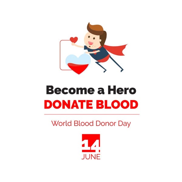
Blood donations had previously been promoted with communications praising blood donors. The implicit reasoning makes sense – people want to be heroes, by donating blood you become a hero, so you want to donate blood. It doesn’t take much Googling to find it’s a common (tried and true?) means of encouraging donation around the world:
We started the strategy process by doing what I call colour-by-numbers strategy. I don’t mean that in a derogatory way. Colour-by-numbers strategy is how you end up with a pointier questions – and as we’ve discussed, that’s a reliable way to improve the average effectiveness of your ideas. That meant looking at the data.
Marie-Claire Manson was leading strategy on the project. What was she looking for in the data? Basically, she wanted to find a pointier question by finding the most influential and influenceable factors which impact people’s propensity to donate blood. Here are the kinds of things she investigated with the data available:
Are some kinds of people more likely to donate blood than others? Why?
Are some reasons for donating blood more common than others?
Are some reasons for not donating blood more common than others?
Are there points in the journey from complete obliviousness to regular donation that people are particularly likely to drop away?
These are very similar to the questions one would ask doing strategy for a commercial business, with the notable absence of competitors. (Though perhaps other ways to feel good about oneself could be seen as competitors? Hmm. Maybe.)
Answers to any one of these questions could have led to a pointier question as a creative springboard for ideas. But we had three problems. The first was that we didn’t have all of the data we might have liked to investigate those issues. The second was that, with the data available, nothing was really leaping out. There weren’t any really strong outliers.
The third problem was a bit more specific to being a creative agency. With what few weak outliers we could find, the data pointed us towards very well-worn territory. On some level, in creative agencies, you’re always looking to do something that hasn’t been done before. Partly that’s because novelty contributes a certain amount of effectiveness itself. And partly it’s because you don’t get a reputation for creative thinking by doing what’s been done before.
(I say that’s a problem specific to creative agencies because in many other contexts, if a good idea has been done before and worked well, it’s not called boring – it’s called best practice.)
In terms of the recent posts on Strat Your Engines, the data we had were pointing us towards a very well-established mental model for addressing blood donations. People avoid it because of time, convenience, fear of needles, disqualification. People do it because of loved ones’ lives being saved by donated blood, wanting to give on a financial budget, wanting to save lives, etc. The colour-by-numbers approach was directing us towards another “how good would it feel to save a life?” idea.
So, hitting this wall and still believing something new and better was possible, we got four heads in a room with a whiteboard: strat lead MC Manson, executive creative director Anne Boothroyd, creative director Scott Maddox, and myself. Instead of trying to extract implications from the data, we started throwing around hypotheses and observations that at least did not contradict the data available.
Interesting observations often come from apparent contradictions. And it’s also often useful to play around with extremes, whether they’re extreme outliers in data or thought experiments about the implications of pushing something to an extreme. In either case, the room kept coming back to one observation with an apparent contradiction:
When disasters like the Christchurch mosque terror attacks or the Whakaari volcano eruption occur, people line up to donate blood. The contradiction is – just as many people are in need of donated blood every day. Did people not know this?
Well, there was another apparent contradiction in the data. While a bunch of other statistics around knowledge and understanding were holding steady, the perceived need for blood donations was dropping along with rates of giving. In other words, there were an increasing number of people who understood the need for blood but didn’t see a need for donations.
The usual ways of thinking about blood donations couldn’t make sense of this. In theory, if people know that donated blood is necessary, they should surely see a need for donations.
The mistake in our thinking was a hidden assumption, a hidden premise. We assumed a direct connection between seeing a need for blood and seeing a need for blood donation. But to make that connection, an extra unspoken belief is required: “Not enough blood is being donated.”
Technically, we didn’t have data on that belief. It wasn’t a question being asked in surveys, at least not framed in that way, because the survey was designed with the same hidden assumption. But as a hypothesis, it explained the contradiction. People understood that blood was needed. But if they also thought that enough people were already donating, then they didn’t conclude there was a need for (their) blood donations.
More significantly, this hypothesis also explained why the perceived need for donations had been trending downwards in spite of consistent messaging in the market. Folks were walking around seeing ads praising the heroism of blood donors. They were supposed to think, “That could be me! I want to be a blood donor too!” Instead, they could be thinking, “Well, thank God someone else is doing it so I don’t have to.” And if they were, that would explain the trend in the data.
So the strategy was to reverse course. Stop telling potential donors that there were lots of heroes out there already donating and start emphasising a need for blood so significant and consistent that they would be left feeling with a sense of urgency that there’s no way enough people were donating. (Which was, of course, the truth.)
And what made that message interesting enough to pay attention to? Well, we had our other interesting contradiction. When heavily publicised disasters strike, two things happen:
People feel helpless and want to do something to help.
People don’t believe the usual heroes giving blood are sufficient to meet the need.
So they give. So the creative challenge was to take this feeling of “there aren’t enough donors” that comes with big dramatic events and evoke the same feeling from the smaller scale everyday individual disasters that drive NZ Blood Service’s needs for blood. Show that those everyday needs are just as dramatic as the big disasters.
The team1 came up with the campaign “Unseen Emergencies”. The essential idea was that it’s because these disasters are happening every day that they get no attention. A range of very clever executions brought the idea to life in a variety of ways.
A television commercial showcased a variety of blood donation needs in everyday situations, with lots of drama.
Radio ads had well-known journalists reading headlines of everyday individual disasters and then explaining that they won’t be saying any more about the story because they happen too often to be newsworthy.
Print ads had dramatic messages “hidden” in blood-red words highlighted inside of larger more prosaic descriptions.
Digital out-of-home billboards updated with the number of people who needed donated blood and blood products each day.
The results were so staggering that we had to check with the client several times to confirm the numbers. Donations went way up while budget spent went down – in other words, the cost-per-donation plummeted.
This kind of thing is the sweet spot where everything lines up.
On the strategy side of things, we had an “insight” in the form of an unquestioned assumption that – once questioned – revealed a more influential factor to focus on than the usual way of looking at the problem.
We had a second “insight” in the form of the apparent contradiction between responses to publicised and unpublicised needs.
The first provided direction, the second provided inspiration.
Creative had a very good overarching idea off the back of that direction and inspiration.
Creative had very good executional ideas off the back of that overarching idea.
The ideas were executed very well (in my opinion), including by production company Film Construction.
The executions reached a large number of people repeatedly, the work of media strategist Andrea Long.
Any one of those things could have gone wrong and lessened the impact of the work.
In terms of the model of idea quality we’ve been using, what happened? The way we were thinking about the problem was constraining us to a territory of obviousness, things that had been done before, and there was a cap on how effective any of those ideas could have been. Reframing the problem with the new understanding of the most influential factors opened up ideas that had more potential for effectiveness.
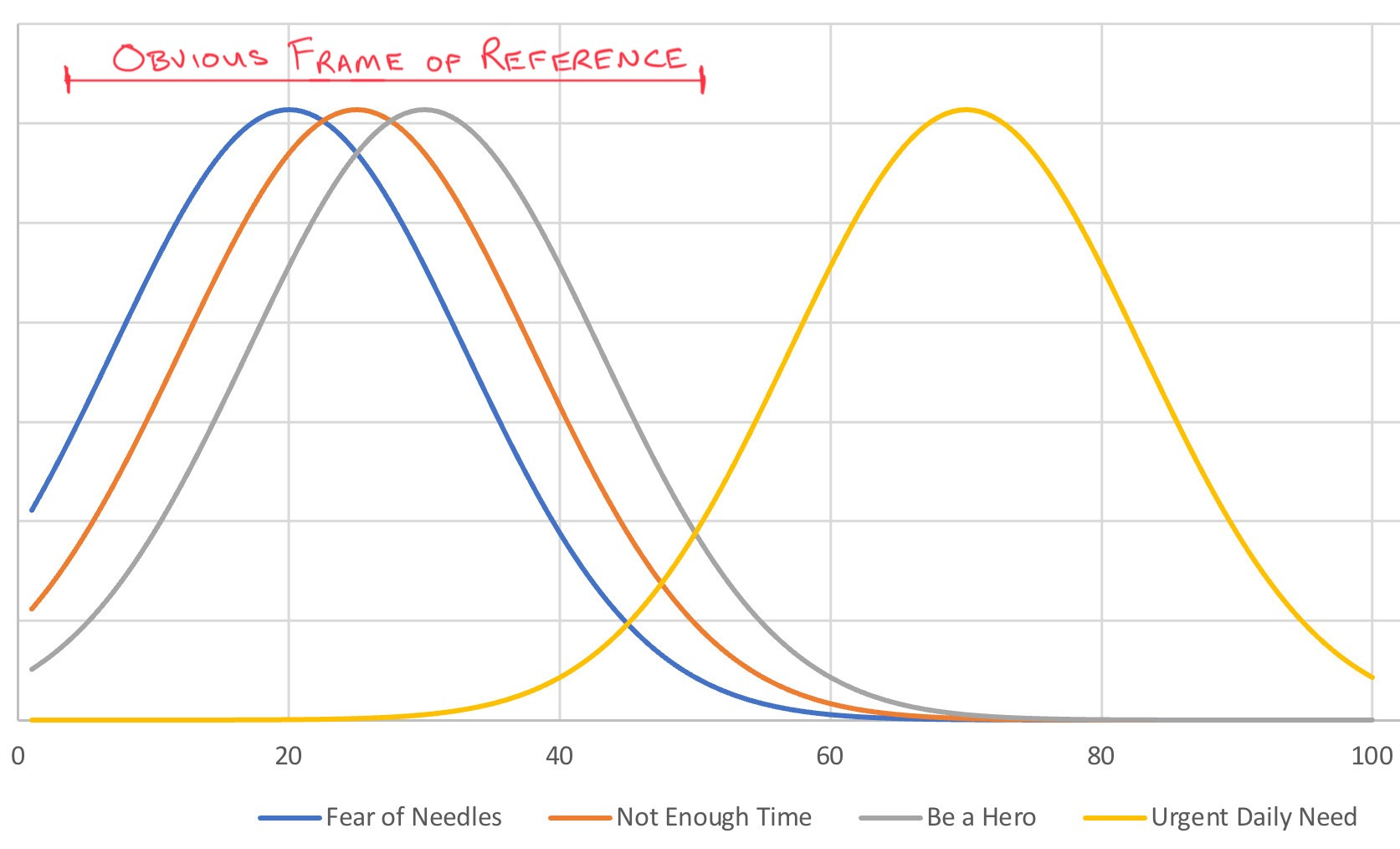
It is worth noting that a really great idea from the old directions would still have outperformed a really terrible idea from the new direction. (According to this entirely unscientific graph I invented to make my point.)
All of this is still in the realm of pointier questions. It wasn’t quite as straightforward as colour-by-numbers pointiness – just looking at the data and finding the most relevant issue to focus on. This time, insights were involved. And that does mean that, to some extent, we got lucky. But I’ll talk about that more another time.
That is, MC, Anne, Scott and the broader YoungShand team. Besides facilitating that initial workshop, I was barely involved.