Better Odds: A Model of Creativity
A useful way to think about ideation
Models simplify complex situations down to a few relevant elements and their relationships to each other. For example, a city train map ignores things like elevation and minor turns, simplifying down to just specific lines, stops, and points of intersection.
I want to introduce a very simple model for thinking about the outputs of ideation. For me, it tends to come to mind when thinking about group ideation – ideation workshops – but the same principles apply to any situation where a number of ideas are being produced for some specific objective.
I’ve been intentionally vague in defining “idea quality”, for two reasons:
What constitutes “quality” depends a lot on both context and the kind of objective. For example, ideas for reducing business costs will likely be judged in dollars saved (a continuous scale), while ideas for getting a venue opened by New Year’s Eve might be judged in confidence of success (a binary fail/succeed objective).
For our purposes here, it only really matters that idea quality can vary – that is, there can be better or worse ideas.
(One other aspect of ideation that I’m setting aside for now is that ideas seldom appear fully formed. I’ll discuss another time the enormous value of things like a good creative director or sharing ideas around to develop the seed of an idea.)
So, imagine a workshop room coming up with ideas, and let’s imagine that we can evaluate each idea’s quality on a scale from the worst idea to the best idea. Alan made a point in the comments about the difficulty of accurately evaluating idea quality without testing – it’s a good point, but I’ll cover it another time. For now, it’s enough to know that each idea varies in quality, however uncertain we might be about its precise value.
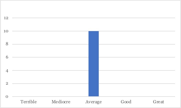
We start having ideas. The room generates ten ideas. We don’t know it yet, but all of these ideas are average in quality.
We keep going, coming up with more ideas. Again, a lot of them are average, but some that are a bit worse and a bit better also appear. We may or may not be aware yet that they are mediocre or good ideas. At this point, we’re just having a lot of ideas.
As we keep going, a minority of ideas at the fringes appear too – a few really terrible ideas and a few great ideas. Again, if we’re just coming up with ideas without reflecting too much on evaluating them as we do so, we don’t necessarily know that the ideas are terrible or great while we’re having them. (That said, when you have a really great idea, you often feel it.)
So the room has now generated 61 ideas. Among them are two great ideas, three terrible ideas, 10 or 11 mediocre and good ideas, and 35 average ideas.
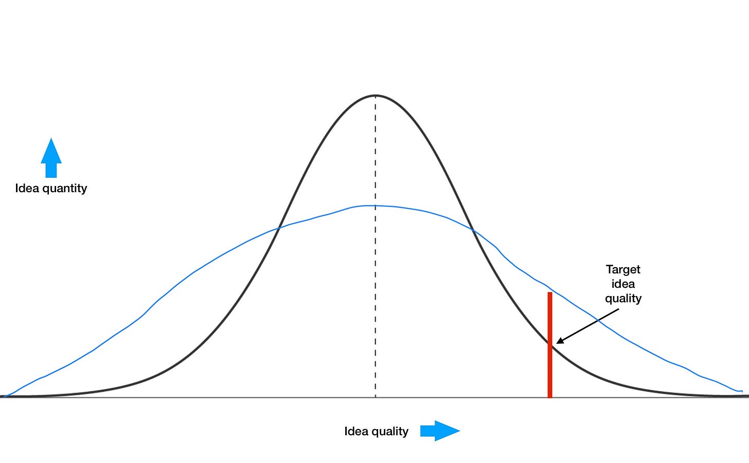
While the quality of any individual idea is not predictable, the quality of ideas overall is not completely random. If idea quality were completely random, we’d end up with roughly the same number of ideas in each quality bin – about 12 terrible, 12 mediocre, 12 average, etc. Instead, the distribution of idea quality follows a bell curve. It’s “normally distributed”. We get a picture of idea quality en masse that looks like this familiar bastard1:
And as discussed previously, we also have some minimum standard of idea quality that we are looking for in our ideation. Let’s say it’s about here:
Now, for our purposes, the area under the whole curve represents the number of all of the ideas generated of any quality, and the area under the curve to the right of that red line represents the number of ideas that are good enough by our standards.
The great thing about a (good) model is that changes in real life are reflected in the model and changes in the model are reflected in real life. So using this model as a mental framework for ideation effectiveness helps give us ideas for how to improve ideation in real life.
Our challenge is this: how do we increase the area under the curve to the right of that line?
Logically, there are four ways to do this.
We can lift the whole curve.
We can shift the curve to the right.
We can shift the red line to the left.
We can change the shape (distribution) of the curve.
Each of these has analogues in the real world.
Lifting the whole curve means simply having more ideas overall, assuming the same distribution in the quality of those ideas. In our example above, we generated two great ideas out of 61 ideas in total. In theory, if we had generated 122 ideas instead, we should have around four great ideas. I mentioned this earlier as either spending more time ideating, having ideas faster, or both.
Shifting the curve to the right means increasing the average quality of the ideas. I discussed one way to do this last time: with better questions. I talked about better questions being either pointier or more interesting. More specifically here, it’s pointier questions which shift the curve to the right. More interesting questions have a different effect which I’ll cover soon.
Shifting the red line to the left means lowering our standards for what a good-enough idea is. Not ideal, but life isn’t ideal, and sometimes when we’re short on time and resource, that’s what we have to do.
And finally… changing the shape of the curve. What can that mean? One example would be a flatter curve. Flattening the curve without increasing the total area under the curve would increase the area under the curve to the right of the red line. In the real world, that would reflect having fewer average ideas and more terrible and great ideas.
How to do that in the real world isn’t quite so clear, so we’ll look at a few factors which influence the distribution of idea quality next.
But I’ll make one observation that will give you a little hint. The averageness of that big lump of ideas in the middle tends to correlate with their obviousness. So the outliers, both terrible and great, tend to be non-obvious.
I should note that while this all aligns with my good/better/great models for ideation, and I draw some quite different conclusions from it, the notion of representing idea quality on a bell curve did not originate with me. (Going through old notes to find the precise reference.)


